Case study · Aspero · Yubi · 2022 to 2025

A $1.7M loss, turned into $430M.

There was no retail product when I joined, only a thesis that wasn’t landing. A design-led initiative took it from MVP to tested app to an independent brand my team created: Aspero. From a $1.7M loss in FY23 to $430M in FY25.

My roleDirector of Design · Design-led zero to one
Team3 designers · 1 researcher · 1 content strategist
StakeholdersCEO · CFO · CPO · Marketing · Engineering
Timeline2022 to 2025 · MVP to independent brand
ScopeStrategy · Branding · B2C, B2B and B2B2C platforms
Outcome$430M in FY25 · from a $1.7M loss in FY23
Overview
A retail bond platform, built from evidence up.

Aspero is the story this whole portfolio keeps returning to: design leading a business, not decorating one. This page now carries the full account, the users and their fears, the MVP that earned the app, the version that earned the brand, and a screen-by-screen tour of the product that turned a written-off thesis into $430M of volume. Start at the situation, or jump straight to the tour from the rail.

01 · The business situation
There was no product. There was a thesis that wasn’t working.

The market thesis was real and enormous: a ₹226 trillion bond market with under 5% retail participation, while 53% of India’s household financial assets sat parked in fixed deposits. The barrier was never money. It was fear, complexity, and low trust in financial platforms. Yubi’s fixed income business had genuine B2B heritage serving wealth distributors and advisors, but the retail attempt, then carrying the Yubi Bonds name, wasn’t landing. FY23 closed at a $1.7M loss, and internally the appetite for another try was thin.

This is the moment most companies hand to a product team with a backlog. Yubi handed it to design. Not to redesign an app, because there was no app worth redesigning, but to find out whether a retail fixed income business could exist at all, and what it would have to feel like.

02 · The strategy · The Trust Architecture
MVP first. App later. Belief throughout.
Retail investors don’t buy bonds. They buy certainty.

We refused to build the full product on an unproven thesis. The working hypothesis was written on the wall: if we simplify financial complexity and make safety feel visible, users will trust enough to act. Everything else became a test of that sentence.

The evidence base came first: 200 surveys across Tier 1 to 3 users, 80+ in-depth interviews across two age cohorts, five expert sessions with financial advisors, ethnography in Tier 2 markets, usability tests, and Amplitude funnel analysis. The findings were sharp: 62% of users couldn’t define “yield”, 42% dropped at the PAN step out of data-misuse fear, and 68% preferred FD safety, summed up by one interviewee: FDs feel like a promise, bonds feel like a gamble. Each finding mapped to a behavioural principle, loss aversion to security cues, trust heuristics to familiar palettes and known issuer logos, framing to plain language, overload to curated lists.

The biggest kill was the hardest one: the umbrella brand itself. The hypotheses kept converging on the same finding, retail investors would not extend trust to a name built for institutional lending. The product didn’t need a better interface. It needed its own identity.

03 · The team, and how I ran it
One small pod carried strategy, brand, and product.

The zero-to-one phase ran on a deliberately small pod: three designers, one researcher, and one content strategist, run as a single unit across what would normally be three departments. My team created the Aspero brand end to end: the name, the identity, the voice, all built around calm and certainty instead of fintech noise. As the platform scaled, so did the squad, to 14 across product, motion, and system design, with DesignOps practices (async design reviews, sprint retrospectives) lifting delivery velocity by 60%.

The operating rhythm was executive by design: weekly reviews with the CEO, CFO, and CPO on hypotheses and business metrics, never mockups. And the team itself became an outcome: 95% designer retention against an industry average of 72%, and four promotions earned along the way.

04 · Users and cohorts
Five audiences, one shared instinct: don't lose what I have.

The research (200 surveys, 80+ interviews, two age cohorts, Tier 1 to Tier 3) kept sorting India's savers into a handful of postures toward money. These are the cohorts the product serves, and the reason it serves three business models at once.

B2C · anchor cohortThe FD loyalist35 to 55, Tier 2 and 3, money parked in fixed deposits because they never lose. 68% of research users sat here. Will not move for yield alone; moves only when safety is visibly preserved.
B2C · growth cohortThe first-time investor25 to 34, Tier 1, app-native and yield-curious but vocabulary-poor: 62% couldn't define yield. Wants to start small, learn by doing, and never feel stupid on a screen.
B2C · value cohortThe diversifierAlready holds mutual funds and stocks; wants predictable income to balance the volatility. Compares everything, reads the fine print, and drives the ₹68,000 average order value.
B2BThe wealth partnerAdvisors and distributors managing client books. Need credible inventory, clean execution, and reporting they can put in front of a client without apology.
B2B2CThe platform partnerFintechs and institutions embedding fixed income into their own channels over Aspero's rails. Their users never see Aspero, so the rails have to be invisible and unbreakable.
05 · Empathy and pain points
The enemy was never ignorance. It was anxiety.
The FD loyalist
Tier 2 and 3 · the trust threshold
Thinks"FDs feel like a promise. Bonds feel like a gamble."
FeelsProud of never having lost money. Suspicious of apps that promise more than the bank.
DoesRenews the FD every year. Asks a relative before any financial decision.
PainsJargon reads as deception. An unknown brand asking for PAN feels like a trap. No idea who stands behind the product.
DesignThe FD vs bond comparison anchored on what they trust, SEBI registration up front, known issuer logos, and a name built for calm.
The first-time investor
Tier 1 · the vocabulary gap
Thinks"Everyone talks about yield. I don't actually know what it means."
FeelsCurious but afraid of looking foolish, and of locking money away where it can't be reached.
DoesDownloads, browses, screenshots a bond to ask friends about, and quietly leaves at the first form.
PainsThirty instruments and no way to choose. Terms nobody explains. A KYC that reads like a loan application.
DesignCurated Top 5 lists, plain-language everything, the returns calculator that shows money growing, and micro-step KYC that explains each ask.
The diversifier
Mass affluent · the comparison shopper
Thinks"Show me the numbers next to each other and I'll decide myself."
FeelsConfident with markets, impatient with hand-holding, allergic to anything that smells like a sales pitch.
DoesCross-checks yields against FDs, debt funds, and other platforms before committing a rupee.
PainsRatings, tenures, and payout frequencies scattered across tabs. No single frame to weigh one bond against another.
DesignSide-by-side bond comparison, the yield visualizer, cashflow schedules before purchase, and a portfolio view built for repeat decisions.
The wealth partner
B2B · the professional bar
Thinks"My name goes in front of the client, not yours."
FeelsAccountable for every recommendation, and burned before by platforms that failed mid-transaction.
DoesScreens inventory, models client outcomes, executes in bulk, reports quarterly.
PainsRetail toys can't handle client books. Thin inventory, no audit trail, reporting that embarrasses them.
DesignA dedicated B2B platform on the same rails: depth of inventory, clean execution, and client-grade reporting.
06 · Frictions and drop-offs
Every leak in the funnel had a fear underneath it.

Amplitude gave us the where; interviews gave us the why. Mapping the funnel's leaks against the research produced a short, brutal list, and every one of them became a named design intervention. This table is effectively the product backlog that built Aspero.

Where it leakedThe friction underneathThe intervention
First openA wall of instruments and jargon; 62% couldn't define yieldCurated Top 5, plain language, learn-by-seeing calculator
Considering68% anchored to FD safety; bonds felt like a gambleFD vs bond widget: compare against what they already trust
PAN step42% dropped, fearing data misuse and credit-score damageSoft-check reassurance at the exact moment of hesitation
KYC middleEleven steps read as an interrogationMicro-step KYC, 11 steps to 5, progress saved throughout
PaymentLarge-ticket fear at the final commitCashflow schedule shown before money moves; accessible ticket sizes
QuittingLeaving meant losing everything enteredA quit flow that reassures: progress retained, resume anytime
07 · MVP
Six months from research to a live bet, before the app was ever funded.

We shipped the MVP before the app: a deliberately narrow web product that existed to test the trust hypothesis with real money, not to be complete. Curated inventory instead of a catalogue, the comparison widget instead of a learning centre, a thinned KYC instead of the full stack. Three iterations in six months, each one killing or confirming an assumption about audience, positioning, ticket sizes, and trust language.

It worked, measurably: conversion rose 61% and onboarding time fell 35% across the iterations, which is what unlocked funding for the full application. Just as importantly, the MVP retired the wrong direction, the data showed the Yubi Bonds name itself suppressing trust, which set up the brand decision that came next.

6 moResearch to live MVP
3Iterations to product-market signal
+61%Conversion across iterations
−35%Onboarding time
08 · Version 1
The full app, the independent brand, and four signature solutions.

Version 1 was where the validated thesis became a product with a name of its own. Aspero launched in October 2023 as an independent brand, and the app shipped the four signature solutions the research had demanded: the Yield Visualizer that plays returns out over time, the FD vs bond comparison widget, micro-step KYC cut from 11 steps to 5, and the predictable-return dashboard that replaces uncertainty with a schedule.

The same release carried the platform strategy: B2C for retail investors, B2B for wealth partners, and B2B2C rails for platform partners, three doors into one inventory and one trust system. Every screen in the tour below is a Version 1 surface or its direct descendant.

01Ship the MVP before the appA six-month sprint from research to launch, three iterations to MVP. Conversion rose 61% and onboarding time fell 35% before the full app was ever funded.
02Test hypotheses, kill the wrong onesAudience, positioning, ticket sizes, trust language, every assumption ran the same loop, and the data retired the Yubi Bonds direction.
03Brand it independentMy team created Aspero: name, identity, and voice, engineered for certainty. The rebrand was a trust decision, not a cosmetic one.
04Design all three sidesB2C for retail investors, B2B for wealth partners, and B2B2C distribution rails, carried by four signature solutions: the Yield Visualizer, the FD vs bond comparison widget, micro-step KYC (11 steps down to 5), and the predictable-return dashboard.
09 · Chasing the north star
Not an app that sells bonds. A place where idle savings become predictable income.
The north star was never a transaction. It was the second investment.

The vision we kept steering by: move a meaningful share of India's FD-parked household savings into transparent, predictable fixed income, without ever betraying the safety instinct that put the money there. That reframes every metric. The first purchase only proves curiosity. The north star metric is the trusted repeat, the second investment, made without a phone call, because the first one behaved exactly as the screen promised.

Chasing it reshaped the roadmap in a specific order: first make understanding effortless (comparison, calculator, plain language), then make commitment safe (micro-KYC, schedules before money moves), then make ownership rewarding (portfolio, payout calendars, reinvestment), and finally make the rails serve partners so the same trust compounds across B2B and B2B2C. Retention moving from 31% to 45% is that loop starting to turn.

10 · The application-level user journey
Eight moments, three famous drop-offs, one loop.
THE HABIT LOOP · THE SECOND INVESTMENT Land on home CURATED, NOT A CATALOGUE Learn, compare FD VS BOND, LIVE Pick a path BASKET BY GOAL · DIRECTORY Evaluate a bond RETURNS PLAYED OUT FIRST KYC, once 5 MICRO-STEPS, FROM 11 Invest SCHEDULE BEFORE MONEY Track PREDICTABLE-RETURN VIEW Paid, reinvest PAYOUTS ON A CALENDAR Research Compare Goal Timeline Auto pay Payouts Live monitoring Threats Gains 62% COULD NOT DEFINE YIELD PLAIN LANGUAGE EVERYWHERE 68% ANCHORED TO FDS COMPARISON AS CLARITY 42% DROPPED AT PAN SOFT CHECK · PROGRESS SAVED RED IS WHERE THE RESEARCH FOUND THE FEAR ORANGE IS WHAT THE DESIGN ANSWERED WITH
The whole app in one path, top to bottom: learn, trust, commit, own, repeat. The three researched drop-offs sit exactly where fear peaks, and each has a named answer.
11 · Tour · Onboarding
Confidence is a sequence of small, safe steps.

The research said it plainly: the enemy wasn’t ignorance, it was anxiety. Every mechanism below exists to convert one specific fear into one specific moment of confidence.
01BondBasket: goals before productsPeople don’t wake up wanting bonds. They want a child’s education, a home, a calmer retirement. BondBasket curates instruments around psychological investment goals and risk temperament, so the first decision is “what am I building?”, never “which of 30 bonds do I understand?”. Mental accounting does the heavy lifting, and visible progress toward a named goal keeps completion bias working for the user instead of against them.
02Comparison in real timeAnxious investors anchor on what they know, so we let them. The FD vs bond widget compares any instrument against the fixed deposit they already trust, live, and the Yield Visualizer plays out returns over time before a rupee moves. Side-by-side bond comparison puts yield, tenure, rating, and payout frequency in one frame, turning the framing effect from a bias to exploit into a clarity tool.
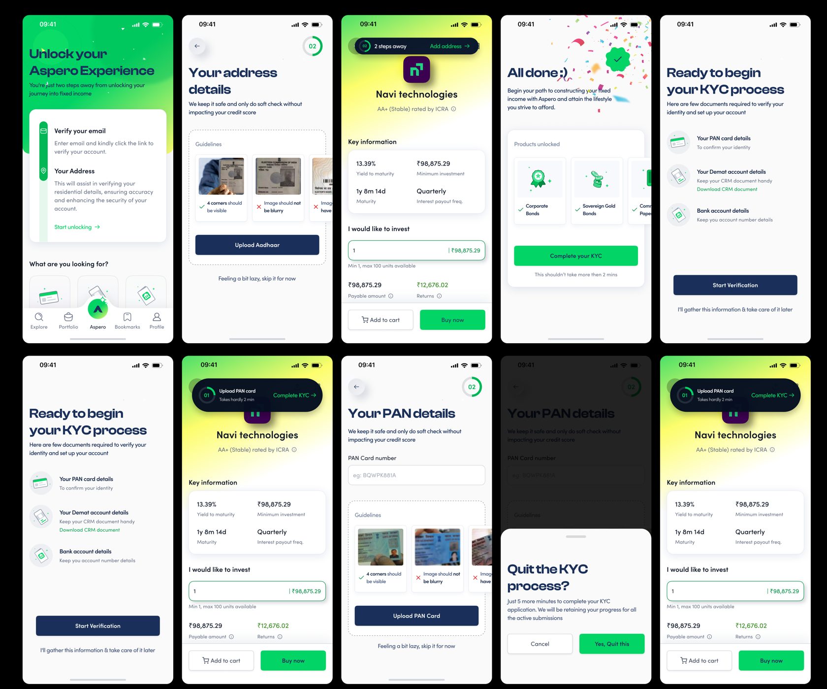
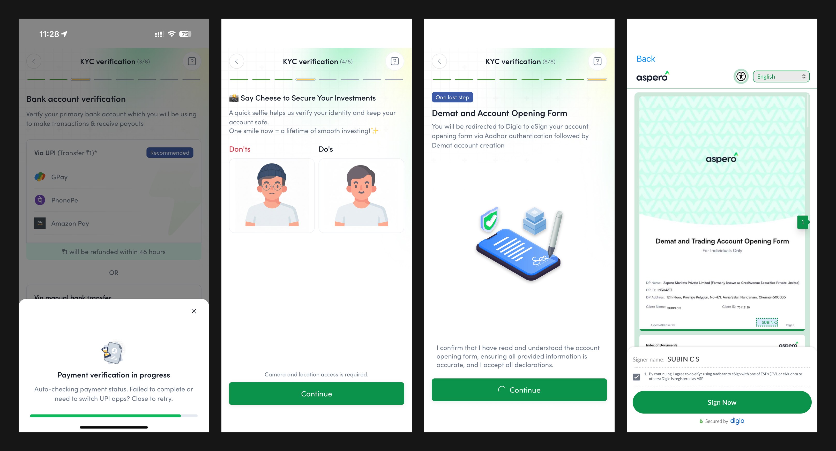
03Defusing the anxious momentsThe 42% PAN-step drop was fear, not friction, so micro-step KYC explains at the exact moment of hesitation: a soft check that won’t touch your credit score, progress that saves itself, reassurance cards at every sensitive field. Curated “Top 5 for you” lists cap cognitive load, the predictable-return dashboard replaces uncertainty with a schedule, and even the quit flow reassures: leave anytime, your progress is retained.
The Aspero KYC and onboarding flow: verification steps, PAN details with soft-check reassurance, upload guidance, and the quit flow that retains progress
The onboarding flow: verification, PAN with soft-check reassurance, upload guidance, and a quit flow that keeps your progress.
The live Aspero KYC flow: bank account verification via UPI, the friendly selfie step, the Demat account opening form, and the Digio eSign screen
Bank verification via UPI, a selfie step that smiles back, and a Demat form eSigned through Digio.
+32.27%Increment in conversion
+24%Task completion rate

The full before-and-after of this flow, the 120-screen legacy KYC against the guided rebuild, has its own deep-dive case study.

12 · Tour · The home page
One good decision on top, not thirty equal ones.

The home screen carries the entire trust argument in one glance. The highest-conviction opportunity leads with its yield, rating, and tenure in plain sight; curated shelves replace the catalogue; and the trust markers, SEBI registration, known issuer logos, sit exactly where an anxious eye goes looking for a reason to leave. The job of this screen is not engagement. It is to make the first good decision feel obvious and the platform feel accountable.
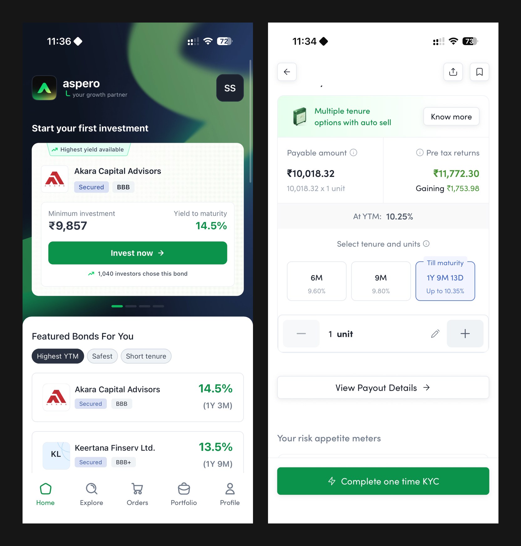
The live Aspero app: the home screen with the highest-yield bond ready to invest, and the returns calculator with tenure options and pre-tax returns
The live home: one lead opportunity, plain numbers, and the returns calculator a thumb-reach away.
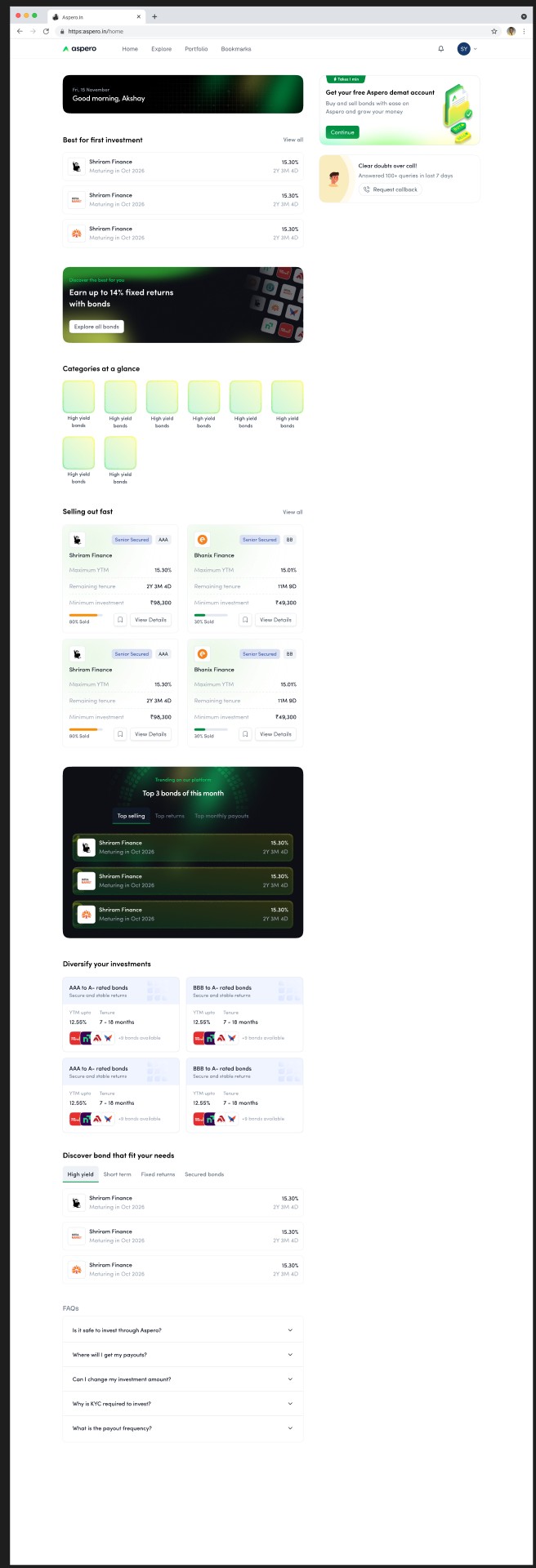
The Aspero web home end to end: best-for-first-investment shelf, the earn-up-to-14-percent explore banner, categories at a glance, selling-out-fast cards with percentage-sold bars, top 3 bonds of the month, diversify-by-rating cards, discover-by-need tabs, and FAQs
The web home, end to end: a first-investment shelf on top, urgency handled honestly with percentage-sold bars, and every shelf framed by need, rating, or tenure rather than ticker.
13 · Tour · Bonds and comparison
Let the anxious anchor on what they already trust.

Comparison is Aspero's native language, because it is the anxious investor's native language. The FD vs bond widget puts any instrument next to the fixed deposit the user already believes in, live, and lets the difference argue for itself. Side-by-side bond comparison holds yield, tenure, rating, and payout frequency in a single frame, so choosing between instruments stops being thirty open tabs and becomes one legible decision.

Screens for this section are being pulled from the design files next.
14 · Tour · BondBasket
Goals before products.

BondBasket flips the catalogue on its head: instead of asking which of thirty instruments you understand, it asks what you are building, a child's education, a home, a calmer retirement, and assembles the basket around that goal and your risk temperament. Mental accounting makes a named goal stickier than any yield figure, and visible progress toward it keeps completion bias working for the user. It is the single most direct translation of the research into a product surface.

Screens for this section are being pulled from the design files next.
15 · Tour · Buying bonds
The schedule appears before the money moves.

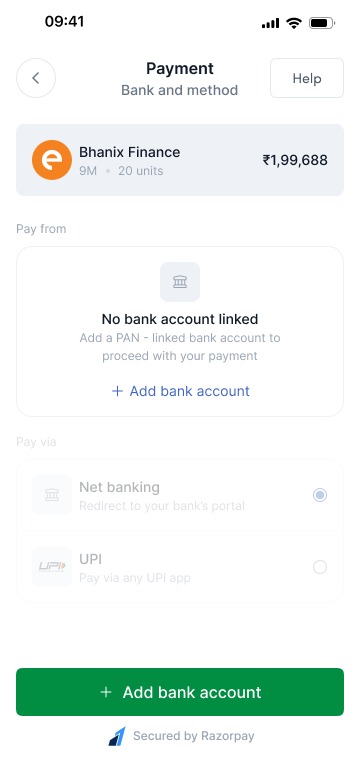
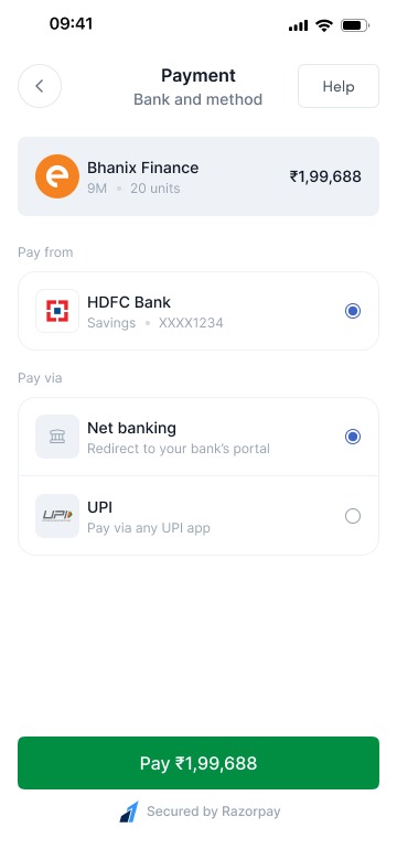
The purchase flow is engineered around the final-commit fear the funnel exposed at payment. Before a rupee moves, the user sees the full cashflow schedule, exactly what comes back, when, and what it sums to, so the commitment is to a visible plan rather than a promise. Ticket sizes stay accessible, the demat and payment steps ride the same micro-step pattern as KYC, and the confirmation reads back the schedule, not a transaction ID.
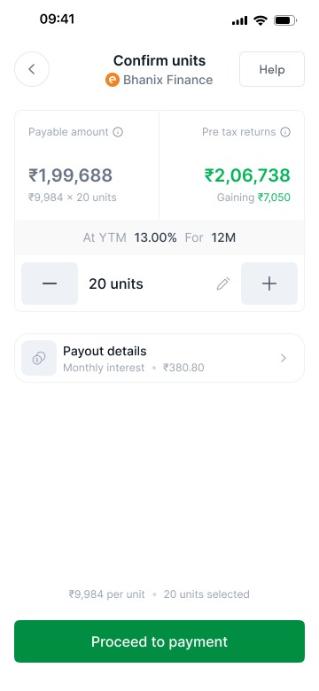
The confirm-units step: units selected with the investment amount, returns summary, and the repayment schedule visible before committing
Confirm units: the schedule and the sum, visible before the commitment.
The payment step in its default state: verified bank account preselected, UPI and net-banking options, and the amount restated in plain language
Payment: the verified account preselected, the amount restated, no surprises.
The payment step with no bank account yet: the flow explains and offers adding a bank account inline instead of dead-ending
Even the empty state commits to the pattern: explain, reassure, and offer the next step inline.
16 · Tour · The wealth calculator
Learning by seeing your own money grow.

For the 62% who could not define yield, the answer was never a glossary. The calculator lets a user play their own number across tenures and watch the return build, pre-tax, in rupees, on a timeline, which teaches yield better than any definition could. It doubles as the Yield Visualizer inside evaluation flows, so the same mental model, money in, schedule out, follows the user from curiosity to commitment.

Screens for this section are being pulled from the design files next.
17 · Tour · Portfolio
Ownership that feels like a schedule, not a gamble.

The portfolio is where the north star lives or dies, because it is the screen that decides whether there is a second investment. The predictable-return dashboard shows holdings as a stream of dated payouts rather than a fluctuating number, upcoming interest on a calendar, principal returning on known dates, everything summing to a plan. It is deliberately the least exciting screen in the app: certainty, performing itself every time the user checks.

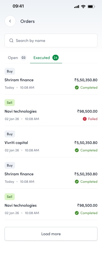
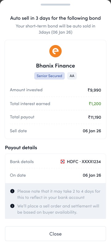
Selling closes the same loop with the same manners: a sell request that quotes the price and settlement plainly, and an orders view where buys and sells sit in one auditable list. Liquidity, the thing FD loyalists quietly feared losing, is a visible two-tap path out.
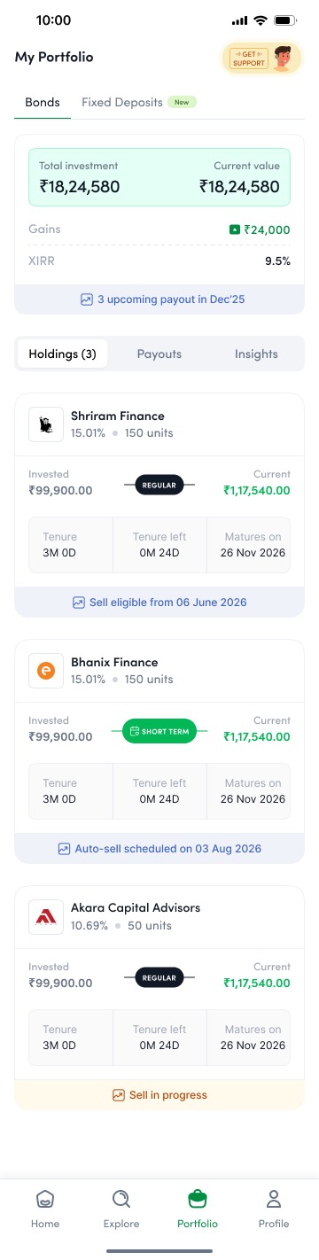
The Aspero portfolio: holdings with invested value and current value, upcoming payouts, and per-bond detail rows
Holdings as a plan: values, dates, and payouts, not a ticker.
The sell request bottom sheet: units, price, and settlement details quoted plainly before confirming the sale
The way out, priced plainly: selling is a first-class flow, not a support ticket.
Executed and open orders: buys and sells in one list with statuses and details
Buys and sells in one auditable list, every order accounted for.
18 · Tour · Bond details
Everything a sceptic would ask, answered on one screen.

The details screen is built for the diversifier's cross-examination and the loyalist's fear in the same layout: the repayment schedule sheet up top, risk appetite meters tied to the credit rating, issuer information with names people recognise, and the SEBI-registered trust block anchoring the page. Yield, tenure, payout frequency, and taxation in plain language, with the schedule always one tap from the calculator.
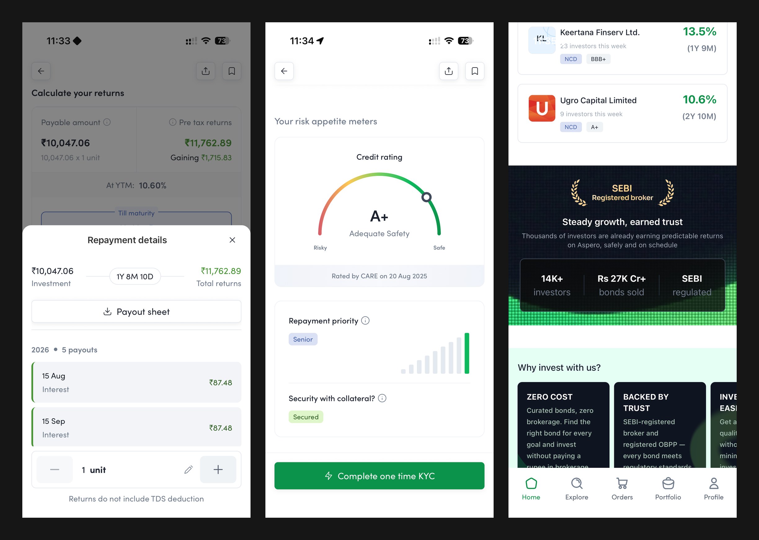
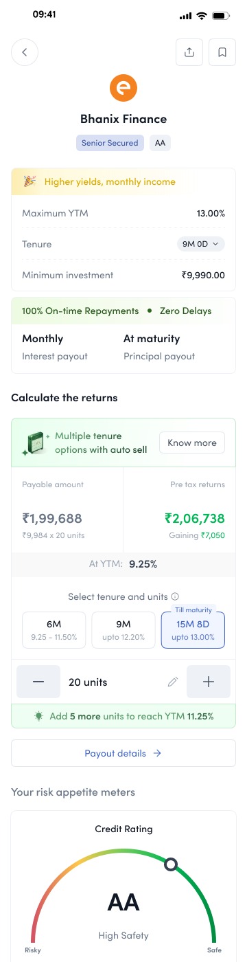
The live Aspero app: the repayment schedule sheet, the risk appetite meters with credit rating, and the SEBI-registered trust section
The live product today. Ratings, yields, and payouts in plain language. Trust markers exactly where the eye looks for them.
The mobile bond details page for an ultra-short-term bond: yield, tenure, and minimum investment up top, followed by returns and key facts in plain language
The details page: yield, tenure, and the minimum ticket answered before the scroll asks for faith.
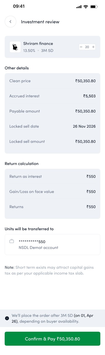
The investment review screen: the chosen bond, units, amounts, and the full breakdown restated for a final check before payment
The review: everything restated once, calmly, before money moves.
19 · Tour · Prepayment
When the money comes back early, the screen explains before the user worries.

Amortising and callable instruments return principal ahead of schedule, and to an FD-trained mind an early credit reads as something gone wrong. The prepayment experience treats that moment as a trust event: the payout is announced in plain language, the repayment schedule redraws itself to show what changed and what remains, and the freed principal is met with a next step, reinvest it, rather than a dead end. Handled well, the scariest surprise in fixed income becomes proof that the platform is watching the money as closely as the user is.

Screens for this section are being pulled from the design files next.
20 · Tour · The bond directory
The full shelf, for the day curiosity outgrows the curation.

Curation gets a first-timer moving, but the diversifier eventually wants the whole shelf. The directory is the complete, filterable inventory, by rating, yield band, tenure, payout frequency, and issuer, with the same plain-language cards as everywhere else, so depth never costs legibility. It also serves the B2B side: the same structured inventory that powers a retail browse powers a wealth partner screening instruments for a client book.
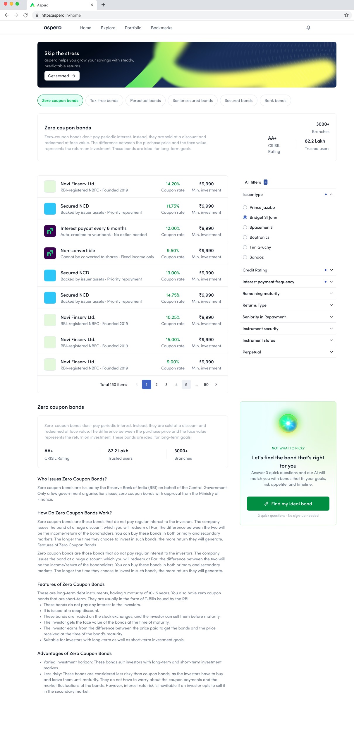

The Aspero bond directory on web: category chips for zero coupon, tax-free, perpetual, senior secured and more, a 150-item filterable list with coupon rate and minimum investment per row, a full filter rail by issuer, rating, payment frequency, maturity and seniority, an educational explainer for the category, and a find-my-ideal-bond helper
The full shelf: 150 instruments, category chips, a serious filter rail, and a category explainer under the list, depth without losing the plain language. For the still-undecided, a three-question helper picks the bond instead.
21 · The brand, in its own colours
Calm, certain, and nothing like a lender.
The aspero wordmark with its ascending peak mark, on the deep ink brand background

My team named the gradient Firefly: growth green rising into optimistic yellow, over a deep ink neutral. The ascending mark reads as a peak, a roof, and an upward arrow at once. Familiar enough to feel safe, fresh enough to feel nothing like an institutional lender, which was precisely the point.
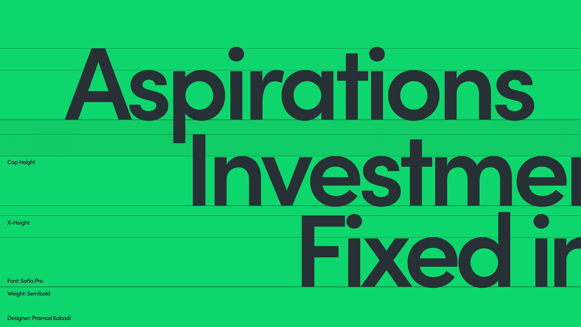

Aspero typography specimen: Sofia Pro semibold headlines set on the brand green, with cap-height and x-height guides
Sofia Pro, semibold. One voice from campaign headline to KYC microcopy.
Aspero campaign hero: a portrait lit in brand green beneath the wordmark, with the line Good investments for great aspirations
22 · Business outcome
The initiative nobody wanted to fund became the growth story.
MetricBeforeAfterChange
Onboarding completion42%67%+25 pts
Conversion rate19%30.6%+61%
Retention31%45%+14 pts
Average time to invest12 min4.2 min-65%
$430MFY25, from a $1.7M loss in FY23
20K+Active investors, from under 300
32%Share of Yubi’s revenue en route
3Platforms: B2C, B2B, B2B2C

FY23 closed at a $1.7M loss under the old direction. FY25 closed at $430M, with 20,000+ active investors on a platform that started with fewer than 300, an average order value of ₹68,000, and 32% of Yubi’s revenue contributed along the way. Aspero launched as an independent brand in October 2023 and now stands as its own SEBI-registered platform.

23 · What I carry forward
Products fail on belief before they fail on features.
I didn’t design a fintech app. I designed confidence.

Aspero settled two convictions. First, design can lead a zero to one, not just polish one, if it is accountable to business hypotheses rather than screens. Second, trust is not a coat of paint. Sometimes the most important design decision is the name on the door.

Next story
One system. ₹186Cr saved.